")
")

Demo projektek
Gant diagram and timesheets
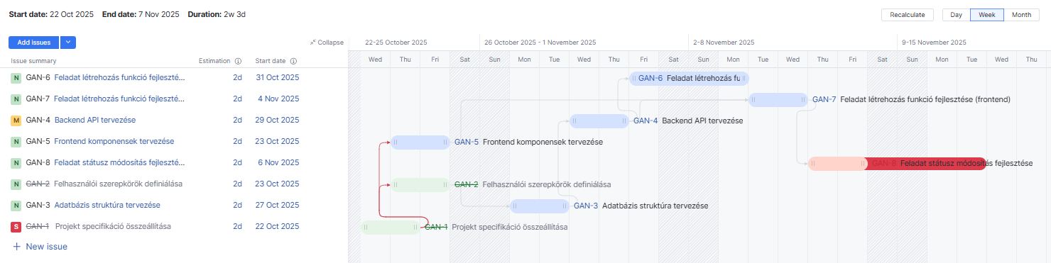
Gant diagram in Youtrack
The Gantt chart visualizes the scheduling and dependencies of project tasks in a time-based bar view. This tool helps to understand the project structure and the relationships between tasks.
Main Features:
- Task List: On the left side, you can see the list of tasks with estimated duration and start date.
- Visualization:
- Each task appears as a horizontal bar representing its duration.
- The color of the bars indicates the status:
- Blue – In progress
- Green – Completed
- Red – Critical or delayed task
- Dependency lines show which tasks are linked to others.
- Dependencies: Multiple tasks are interconnected, making the chart useful for visualizing order and relationships.
- View Controls: In the top-right corner, you can switch between different views (daily, weekly, monthly) and recalculate the schedule.
Purpose:
- Understand the overall project structure.
- Track the order and dependencies of tasks.
- Identify the critical path and delays.
- Optimize resources and scheduling.
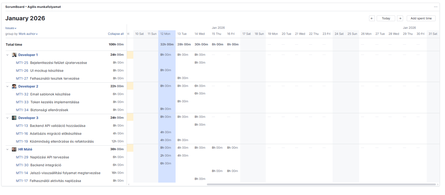
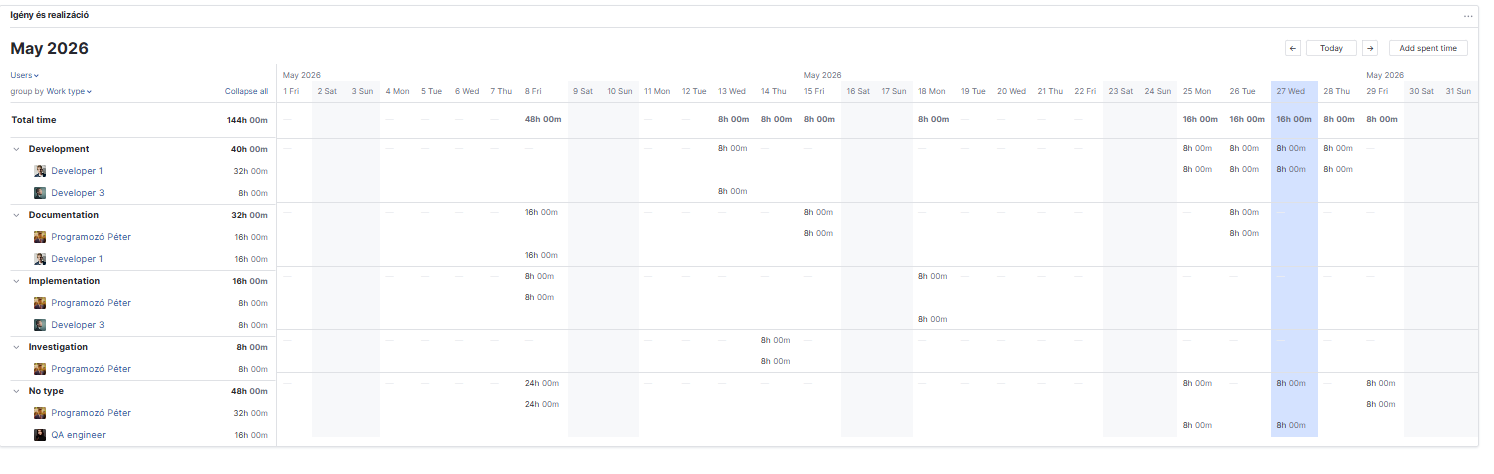
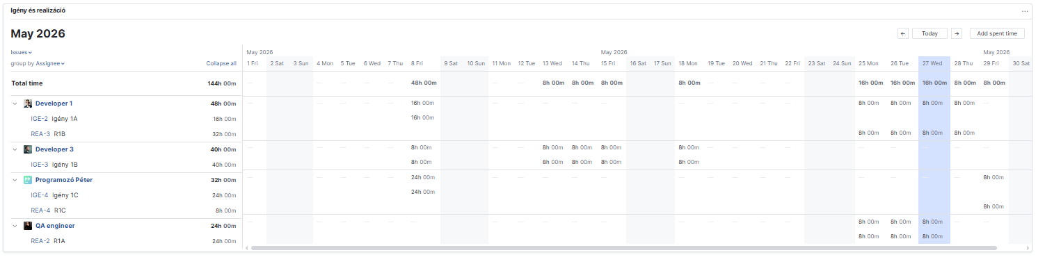
Timesheets in Youtrack
The YouTrack time tracking feature allows team members to log the time spent on individual tasks and visually monitor it in a tabular view. This is especially useful in agile processes where capacity and performance transparency are important.
Main Features:
- Task and Time Tracking List:
On the left side, you can see the tasks assigned to each developer. Each task may display the estimated time, which indicates the planned effort.
- Time Logging (Spent Time):
- The table on the right shows, broken down by days, how much time was logged for each task.
- For example:
- A developer worked 8h 00m on a task on a given day.
- The columns summarize the total daily effort.
- Visualization and Summary:
- The top row shows the total daily time logged by the entire team.
- Each row allows developers to track their own time weekly.
- Color highlighting indicates the current day (e.g., blue background).
- Functions:
- The Add spent time button allows manual time entry.
- Automatic summaries help verify whether the team has met the planned capacity.
- Time tracking data makes it easy to identify overloads or underloads.
Purpose:
- Track actual working time per task and per developer.
- Compare estimated and actual effort.
- Optimize sprint planning and resource allocation.
- Make team performance and capacity transparent.